Dashboard overview
Navigate the dashboard and customize your governance view.
Overview
The dashboard is the first screen you see after logging in. It gives you a real-time overview of your AI governance program, showing key metrics across all areas of the platform.
You can quickly spot areas that need attention, track progress over time and jump directly to any section by clicking a widget.
Personalized greeting
The dashboard greets you based on the time of day. Morning, afternoon and evening greetings change automatically. On special occasions like international observance days, you may see themed greetings.
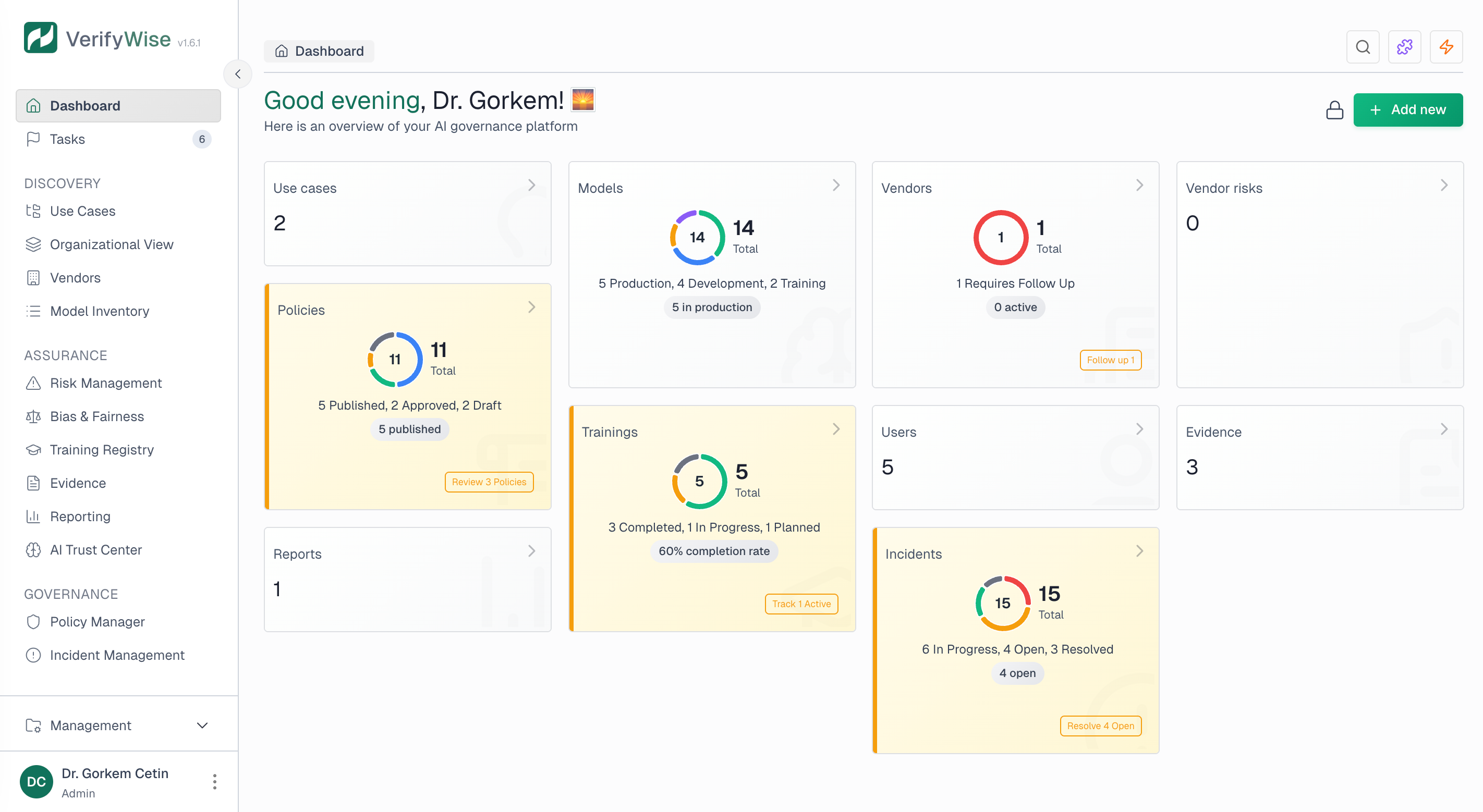
Dashboard widgets
Widget cards display at-a-glance metrics for different parts of your governance program. Each card shows the total count for that category and, where applicable, a visual breakdown of how items are distributed by status.
Use cases
Total number of AI use cases registered in your organization.
Models
AI models tracked in your model inventory with status breakdown.
Vendors
Third-party AI vendors with their current status distribution.
Vendor risks
Risks identified for your AI vendors with severity breakdown.
Policies
Governance policies with their lifecycle status.
Trainings
AI training programs and their completion status.
Incidents
AI-related incidents with resolution status.
Users
Team members with access to the platform.
Evidence
Documents and evidence files uploaded to the system.
Reports
Generated governance and compliance reports.
Status breakdown charts
Widgets that have status workflows show a donut chart breaking down how items are distributed. This makes it easy to see the health of each area at a glance:
- Models: Shows distribution across lifecycle stages like Development, Testing, Production and Retired
- Vendors: Displays vendor assessment status such as Pending review, Approved and Requires attention
- Vendor risks: Shows risk severity levels including Critical, High, Medium and Low
- Policies: Displays lifecycle status like Draft, Under review, Published and Archived
- Trainings: Shows completion status: Planned, In progress and Completed
- Incidents: Displays resolution status such as Open, Investigating and Resolved
Priority indicators
Widgets automatically highlight items that may need immediate attention. Visual cues help you prioritize:
- High priority: Red highlight for critical items like critical vendor risks or overdue policies
- Medium priority: Amber highlight for items that need attention soon but aren't urgent
- Quick actions: Some widgets show action buttons so you can address priority items right from the dashboard
Dashboard views
The dashboard supports two preset layouts via a view toggle. Widget layout itself is not user-customizable.
Switching between views
Use the toggle in the top right of the dashboard to switch between two layouts:
- Operations: Detailed view with status charts and counts for every governance area.
- Executive: Condensed three-column summary focused on top-line metrics.
Navigating from the dashboard
Each widget is clickable and takes you to the matching section of the platform:
- Use cases: Opens the use cases overview page
- Models: Opens the model inventory
- Vendors: Opens the vendor management page
- Vendor risks: Opens the vendor risks view
- Policies: Opens the policy manager
- Trainings: Opens the training registry
- Incidents: Opens incident management
- Users: Opens organization settings
- Evidence: Opens the file manager
- Reports: Opens the reporting section
Quick add from dashboard
The "Add new" dropdown in the top right corner lets you create new items without leaving the dashboard. Use it to quickly add use cases, models, vendors, policies and more.
First login experience
When you first log in, you may be asked to confirm or update your organization name. This makes sure your governance docs and reports show the right organization identifier.
Frequently asked questions
Is my view choice shared with my team?
No. Each user's view (Operations or Executive) is saved in their own browser. Other team members see whichever view they last selected.
How current is the data on the dashboard?
Dashboard data loads when you open the page and reflects the current state of your governance program. To see the latest data, refresh the page. Changes you make elsewhere in the platform show up when you next visit or refresh the dashboard.
Does the dashboard work on mobile devices?
The dashboard is responsive and adapts to different screen sizes. On smaller screens, widgets rearrange into a single-column layout. Full customization features work best on larger screens.